
Request-for-Quote (RFQ) redesign
Overhaul the RFQ process to improve data quality and efficiency.
Univar Solutions
Shipped December 2022
UX Research and Design Lead
Problem
The RFQ process serves as a critical driver of conversions and shapes customers' initial impressions. However, the existing process suffered from inefficiencies.
Outcomes
Reduced touch-points required to generate quotes
Improved turnaround by 5.66 days
Guest RFQ submissions increased 32%

Design Process
Conduct review of existing feedback, heuristic evaluation, competitive analysis, and design concept testing to inform the final designs.
Data Insights
The Digital Adoption survey highlighted online RFQ as the most utilized feature but also as the primary source of dissatisfaction.
From our research, we've identified:
RFQ turnaround times are too lengthy.
Customers find redundant touchpoints frustrating.
There's confusion with form options, leading to duplicate account creation.
Enhancing this process is essential for retaining customers.
Quotes
“It has been a bit more difficult to get a quote than I would expect. I am hoping that the online quote tool will make this an easier activity.” -customer
“I never seem to get quotes in a timely manner. Univar hasn't been considered for purchases because of this.” -customer
“There’s overlap where we are getting new accounts sent over that are already established…” -seller
“Feedback we hear from customers is that the process is redundant. They will give a lot of info to NBD [new business development], then we have to collect a lot of the same information.” -seller
Research Opportunity:
Would collecting more information upfront impact abandonment?
Heuristic Evaluation
I assessed the current experience for additional opportunities for improvement.
Sign in screen
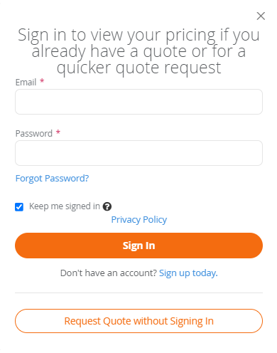
Headline is 18 words long. We should make this more concise, aiming for 4-6 words.
Line height does not meet best practices for readability.
For multiple lines of text, center alignment not meet best practices for readability.
Inconsistent use of sentence case vs title case. Brand guidelines specify use of sentence case for titles and CTAs.
Links rely on color alone to indicate they are clickable, add underline.
Reconsider including “Sign up today” on this screen. It will pull the user off their current journey.
RFQ form (only for guest/non-signed in RFQ)

Line height does not meet best practices for readability.
Touch targets for radio buttons are too small/too close together.
Links rely on color alone to indicate they are clickable, add underline.
Mark fields that are ‘optional’ rather than required.
‘Submit’ CTA should be on the right, ‘Cancel’ on the left.
Font size/weight of orange CTAs does not meet accessibility requirements. Increase to 18.66px/bold.
Radio buttons should have the most common answer pre-selected.
Confirmation messages


Opportunities for improvement
Add visibility to which product had been selected for RFQ (Recognition vs Recall).
Accounts for all the ways that a company might exist in the system (hint: not just purchases). Bonus points for not relying on the customer to select the correct flow. This is a source of duplicated accounts.
Follow line height, alignment, and line length best practices for optimal readability.
Increase font size for brand orange CTAs (insufficient color contrast) and add a secondary indicator to links (do not rely on color alone) to make interactive elements accessible to people with low vision.
Increase spacing between small touch targets (radio buttons and text links specifically) to make elements easier to interact with.
Improve visual consistency to limit confusion and distraction, while building brand trust.
Consider removing “Sign up today” from flow. It will pull them off their primary task. Consider adding “sign up” at the end of RFQ, using the information provided during RFQ.
It appears as a toast message with far proximity to the RFQ CTA.
It doesn’t follow best practices, disappearing too quickly for what’s recommended based on word count.
Lacks feedback regarding the product that has been requested.
Noticeable styling inconsistency between guest and signed-in messages.
Who are we solving for
We need to account for multiple user scenarios in our solution.
Registered users
Addresses and contacts are on file. An email and password are set with the website.
“Pre-registered” users
Partial or full information exists, from offline purchases or previous RFQs. Email exists but no password.
Our existing data told us about the perspectives of existing users. We were missing insights about prospective user expectations.
Net-new user
They’ve never interacted with Univar Solutions online or offline.
Customer Interviews
Goal
Learn RFQ expectations from a ‘net-new user’ perspective
Participants
6 chemical/ingredient buyers
Never purchased from Univar Solutions
Familiar with RFQ
purchase 7+ times/year
Takeaways
They expect a RFQ response within 1-2 business days.
Price is more important than response time, but they’ll go elsewhere if no response within acceptable timeframe.
All preferred a written process over verbal, for tracking and accountability. A web "RFQ" process is preferred over sending an email, expected to be more efficient.
Having rep contact information available is preferred to deal with issues or complexity
Customers are fine providing information upfront when it seems relevant. Most were open to providing more if it sped up the process.
How might we…
Reduce the number of touch-points required to collect necessary information from each user
Obtain enough information upfront without impacting abandonment
Only ask for the minimum information required to quote, whether a net-new, pre-registered or registered customer.
Hypothesis
A dynamic form that differentiates users will allow us to only ask what’s necessary of each user, minimizing touch-points and abandonment risk.
User flow
We held a cross-functional, collaborative working session to identify user flows.

We then documented the data requirements for each screen. From there, I began sketching.